There’s a reason so many kitchens look the same. Stark white cabinets dominated the last decade. They photographed well, felt clean, and seemed safe. But safety gets boring fast and homeowners have started to notice.
The shift is real and it’s visible in kitchens across Orland Park, IL. People are moving away from cold, bright white and toward something warmer. Softer. More livable. Creamy tones are filling that space and they’re doing it beautifully.
Creamy cabinets aren’t just a trend. They’re a smarter long-term choice. They age gracefully. They work with a wider range of countertop materials, flooring tones, and hardware finishes. They make a kitchen feel like a room someone actually cooks and lives in not a showroom display.
If you’ve been considering cream white kitchen cabinets for your home, you’re already thinking in the right direction. This warm, versatile color family pairs with almost everything natural wood, marble, quartz, dark stone, and warm metals. And it works across design styles from farmhouse to modern classic. Kitchen cabinets have become one of the most requested finishes in Orland Park kitchen remodels. Local designers and cabinet suppliers are seeing the demand firsthand. Homeowners want warmth without committing to a bold color. Creamy delivers exactly that with flexibility that stark white simply can’t match.
What Creamy Actually Means in Cabinet Colors
Creamy is not a single color. It’s a family of tones. Understanding that family is the first step to choosing right.
At one end of the spectrum sit soft, barely-there creams that read almost white in bright light. At the other end sit deeper, richer creams with obvious warm undertones close to butter or linen. Everything in between belongs to the creamy family.
What separates creamy from standard white is the undertone. Pure white has no dominant undertone. Creamy tones carry one and that undertone is everything. It might be yellow, peach, beige, or the faintest hint of pink. Each reads differently depending on your light, your flooring, and your countertop.
Popular creamy paint colors include Benjamin Moore’s White Dove and Navajo White, Sherwin-Williams Alabaster and Antique White, and Behr’s Blanc. Each has a slightly different undertone character. None of them look the same in every kitchen.
The takeaway here is simple. Don’t choose a creamy cabinet color from a small chip under a store’s fluorescent lights. Sample it. Live with it. Watch how it changes throughout the day in your actual space.
Why Creamy Cabinets Are the Right Choice for 2026
Design doesn’t move in straight lines. But the direction it’s moving right now is unmistakably warm.
The all-white kitchen peaked and plateaued. It started to feel sterile like a laboratory rather than a home. Creamy tones arrived as the antidote. They carry the cleanliness of white without the coldness. They bring warmth without the commitment of a saturated color.
In Orland Park homes where kitchens are often the social center of the house this matters. A creamy kitchen feels welcoming. It invites people to stay. That’s not something you can say about a stark white room.
From a resale perspective, creamy also wins. It appeals to a broader range of buyers than bold colors or trendy finishes. It’s specific enough to feel intentional but neutral enough to suit many tastes. For homeowners thinking about long-term value, that’s a meaningful advantage.
The creamy trend also plays well with the broader 2026 design movement toward natural materials and warm palettes. Wood tones, stone surfaces, linen textiles, and rattan accents all complement creamy cabinets naturally. The whole aesthetic hangs together.
Understanding Your Kitchen Before You Choose a Shade
Before you commit to any creamy tone, spend some time studying your kitchen. The space will tell you a lot about what will work.
Natural light is the biggest variable. A south-facing kitchen in Orland Park floods with warm afternoon light. A creamy cabinet in this space will look luminous and rich. A north-facing kitchen gets cooler, more diffuse light the same creamy tone might read flat or slightly yellow. Knowing your orientation helps you calibrate.
Artificial lighting matters too. Warm-toned bulbs (2700K–3000K) push creamy cabinets even warmer. Cool LED lighting (4000K+) can neutralize the warmth and make some creamy shades look off. If you’re changing your kitchen lighting as part of the remodel, decide on the bulb temperature before finalizing the cabinet color.
Your fixed elements set the boundaries. Flooring, countertops, backsplash tile, and appliances aren’t changing; they’re the frame within which your cabinet color has to work. Cool gray flooring calls for a creamy with a cooler beige undertone. Warm wood floors pair beautifully with yellow-based creamy tones. Dark countertops create drama with any creamy shade.
Room size and ceiling height shift perception. Lighter creamy shades expand smaller kitchens visually. In larger kitchens with high ceilings, you can go deeper into the cream spectrum without the space feeling heavy.
Take photos of your kitchen at different times of day. Tape up large paint sample cards not small chips. Leave them for a week before deciding.
Choosing the Right Shade for Your Home
The creamy spectrum is wider than most people realize before they start looking seriously.
On the lighter end, shades like Alabaster and White Dove read almost white in bright conditions. They offer warmth without being obviously creamy. These work well in smaller kitchens, spaces with limited natural light, or homes with cool-toned fixed elements.
In the middle of the spectrum sit classic creams like Navajo White and Antique White. These read clearly as warm without being yellow or golden. They’re the most versatile shades in the family and work in almost any Orland Park kitchen layout.
At the deeper end, shades like linen, parchment, and soft butter carry obvious warmth. They work beautifully in larger kitchens with strong natural light and warm-toned materials. In smaller or darker spaces they can feel heavy.
Here’s a practical tip most guides skip. Order actual door samples from your cabinet supplier, not just paint chips. Cabinet finishes apply differently than wall paint. The sheen level, primer coat, and application method all affect how the color reads. A painted cabinet door sample in your actual kitchen is worth far more than a chip in a showroom.
Cabinet Materials That Make Creamy Work
The material behind the finish determines how good the cream looks and how long it stays that way.
MDF (medium-density fiberboard) is the gold standard substrate for painted cabinet doors. Its surface is perfectly smooth and uniform. Creamy paint applied over MDF produces a flawless, professional finish without grain telegraphing through. For painted finishes, it’s hard to beat.
Solid wood is durable and refinishable, but wood grain can telegraph through painted finishes over time especially on flat-panel doors. Species with tighter, more uniform grain like maple and poplar perform better under painted finishes than open-grain species like oak.
Plywood construction in the cabinet box is the right call for durability. Plywood holds screws better than MDF, resists racking, and handles moisture more reliably. In Orland Park kitchens where seasonal humidity cycles are real, plywood box construction is a sound investment.
Primer quality matters enormously for painted cabinets. A proper bonding primer seals the substrate, raises and sands any grain, and gives the topcoat something to grip. Skipping quality primer is the number one reason painted cabinet finishes chip, peel, or look uneven within a few years.
Cabinet-grade paint matters too. Standard interior wall paint doesn’t hold up on cabinet doors. Specify a hard-drying alkyd or waterborne alkyd cabinet paint. Brands like Benjamin Moore Advance and Sherwin-Williams Emerald Urethane are trusted standards in the industry.
Door Styles That Work Beautifully with Creamy Tones
The door style you choose shapes how creamy reads in your kitchen. Some combinations are stronger than others.
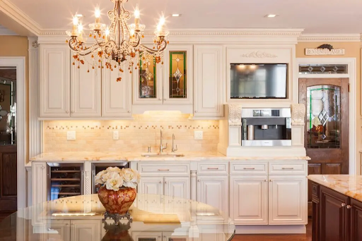
Shaker doors are the most versatile pairing with creamy cabinets. The simple recessed panel and clean frame create subtle shadow lines that add dimension without fuss. Creamy shaker cabinets feel simultaneously timeless and fresh which is exactly why they dominate Orland Park kitchen remodels right now.
Raised panel doors push the look toward traditional. The more ornate profile catches light and shadow in a way that adds richness to creamy tones. This combination works beautifully in formal kitchens and older Orland Park homes with traditional architectural details.
Flat panel or slab doors create a modern-classic result. The absence of detail puts the color front and center. A perfectly applied creamy finish on a flat slab door looks incredibly refined. This is a strong choice for contemporary Orland Park homes.
Inset cabinets where the door sits flush within the face frame add a premium, furniture-like quality to creamy kitchens. The tight tolerances and shadow gap around each door elevate the look significantly.
Glass-front upper doors work well as accents within a creamy cabinet run. They break up visual weight and create an opportunity to showcase dishes, glassware, or decorative items.
Hardware That Elevates the Look
Hardware is the jewelry of your cabinet design. Choose it thoughtfully and it elevates everything.
Warm metals are the natural pairing for creamy cabinets. Brushed gold and unlacquered brass complement the warm undertones of creamy finishes and add a layer of richness. These have been trending in Orland Park kitchen remodels for two years running and show no signs of slowing.
Brushed nickel and satin chrome work well with creamy cabinets that lean toward cooler beige undertones. They keep the palette from getting too warm and suit transitional and contemporary designs.
Matte black hardware against creamy cabinets creates bold, graphic contrast. It’s a strong design statement that works best in kitchens with other black accents light fixtures, faucet, or appliance handles.
On the hardware type question: bar pulls give a clean, linear look. Cup pulls feel vintage and charming particularly at home with farmhouse or traditional creamy cabinet designs. Simple round knobs work well on shaker doors. Mixing hardware types thoughtfully different styles for upper and lower cabinets can work well when the finish is consistent.
Always coordinate hardware finish with your faucet and lighting fixtures. Consistency across these three elements makes the whole room feel intentional.
Countertops That Pair Perfectly with Creamy Cabinets
Countertop selection is where creamy cabinet projects either come together beautifully or fall apart. The pairing matters.
White and cream marble is the classic choice. Creamy cabinets with a Calacatta or Carrara marble top feel genuinely luxurious. The warmth of the cabinet tone softens the coolness of white marble and prevents the combination from reading too cold.
Quartz offers the look of stone with better durability and easier maintenance. Warm-toned quartz with soft veining complements creamy cabinets naturally. Avoid stark, cool-white quartz it can make creamy cabinets look dingy by comparison.
Butcher block and wood countertops create a warm, layered look when paired with creamy cabinets. The combination feels organic and intentional like something you’d find in a well-designed farmhouse kitchen. In Orland Park kitchens with good natural light, this pairing is particularly beautiful.
Dark countertops charcoal quartz, black granite, dark soapstone create striking contrast against creamy cabinets. The light-over-dark combination feels dramatic but balanced. This is a strong choice for homeowners who want visual impact without bold color.
Concrete and honed stone add texture and an artisanal quality that pairs nicely with creamy warmth. These materials suit modern-classic and transitional kitchen designs particularly well.
What to avoid: pure cool-gray countertops with a strong blue undertone. They compete with warm creamy undertones and create a visual tension that’s hard to resolve.
Where to Find the Right Cabinets Locally
Shopping locally for cabinets gives you real advantages. You can see the finishes in person. You can open doors and drawers. You can talk to people who know what works in Orland Park kitchens specifically.
When homeowners search for cream kitchen cabinets in Orland Park area, they find a range of options from big-box retailers to local cabinet showrooms and custom cabinet makers. Each serves a different need and budget.
Searching for cream kitchen cabinets near me is worth doing before you commit to anything online. Photos on a screen don’t capture how a finish looks in real light. A showroom visit changes everything. Bring a photo of your kitchen, samples of your flooring and countertop materials, and any hardware you’re considering. A good showroom consultant will help you narrow the field significantly.
For Orland Park homeowners doing a full kitchen remodel, working with a local cabinet maker or semi-custom supplier often delivers the best result. They understand regional design preferences, can accommodate the specific dimensions of older homes in the southwest Chicago suburbs, and stand behind their work with local accountability.
Creamy Cabinets in Different Kitchen Styles
One of the strongest qualities of creamy cabinets is how well they adapt to different design languages.
Farmhouse kitchens are perhaps the most natural home for creamy tones. Creamy shaker cabinets, an apron-front sink, open shelving, and shiplap walls create an aesthetic that feels genuinely timeless. It’s a combination that Orland Park homeowners have embraced enthusiastically.
Transitional kitchens the most popular style in suburban Illinois right now use creamy cabinets as the bridge between traditional warmth and modern simplicity. Shaker doors, minimal hardware, clean lines, and a warm quartz countertop define this style perfectly.
Traditional kitchens push the creamy palette further with raised panel doors, decorative corbels, furniture-style details, and warm wood accents. Creamy in this context feels rich and considered not plain or safe.
Modern classic kitchens strip away the ornament and let the creamy finish do the work. Flat slab doors, integrated hardware or minimal pulls, and strong countertop contrast create a sophisticated result that holds up well over time.
Two-tone kitchens are a strong 2026 trend. Creamy upper cabinets paired with a deeper tone on lower cabinets or the island navy, forest green, warm charcoal add visual depth without sacrificing the warmth the creamy tone delivers. This is one of the most requested combinations in Orland Park kitchen designs this year.
Creamy Cabinets Beyond the Kitchen
Don’t limit creamy to the kitchen. The tone works beautifully throughout the home.
Bathroom vanities are perhaps the best secondary application. A creamy painted vanity with warm hardware, a stone countertop, and a framed mirror feels luxurious without trying too hard. It also photographs beautifully which matters if you’re ever listing the home.
Laundry room cabinetry benefits from creamy warmth. A room that’s purely functional gets a layer of care and intention with creamy cabinets and a clean countertop.
Home office built-ins in creamy create a refined, library-like atmosphere. Pair with dark wood shelving inserts and warm lighting for a room that feels genuinely inviting to work in.
Mudroom cabinetry in creamy is practical and visually grounding. The warmth of the tone softens a high-traffic space that might otherwise feel purely utilitarian.
Living room built-ins bookshelves, entertainment units, and flanking cabinets around a fireplace look exceptional in creamy tones. The color integrates architectural millwork with the room’s overall palette without demanding attention.
The key to using creamy consistently across multiple rooms is testing each space independently. The same paint color can read differently in a north-facing home office versus a south-facing kitchen. Sample before committing in each new space.
Common Mistakes to Avoid
These mistakes come up repeatedly in creamy cabinet projects. Knowing them ahead of time saves real money and frustration.
Choosing without testing in your actual space. A creamy shade that looks perfect in a showroom can look yellow, pink, or flat in your kitchen. Always sample on a real cabinet door in your actual light conditions before ordering.
Ignoring undertones. This is the most common and costly mistake. A creamy cabinet with a yellow undertone installed next to cool gray flooring creates a visual conflict that no amount of styling fixes. Match undertones to fixed elements.
Choosing door style before color. Color should come first. Once you’ve identified the right creamy tone for your space, door style is the next decision not before.
Skipping quality primer. Painted cabinets that chip or peel within a couple of years almost always trace back to inadequate priming. Don’t let a contractor skip this step to save time or money.
Using standard wall paint on cabinet doors. Wall paint doesn’t harden sufficiently for cabinet surfaces. Specify a cabinet-grade paint product. The difference in durability is significant.
Buying without seeing in person. Online photos of creamy cabinets are useful for inspiration but unreliable for color accuracy. Visit a showroom. See the finish under real light with your actual material samples beside it.
Maintenance and Care That Keeps Creamy Looking Great
Creamy cabinets are not high maintenance but they do need the right care routine.
Wipe cabinet doors and drawer fronts weekly with a soft, damp cloth. Mild dish soap diluted in water handles most kitchen grease and cooking residue without damaging the finish. Dry immediately after cleaning standing water at door edges and around hardware can lift paint over time.
Avoid abrasive scrubbers, bleach-based cleaners, and anything with ammonia. These damage finishes regardless of paint quality.
Address chips and scuffs promptly. Small touch-ups with the original cabinet paint are easy if done quickly. If you wait, the damage spreads and the repair becomes more involved. Keep a small amount of your cabinet paint stored for touch-ups label it with the color name and the room it was used in.
Grease accumulates fastest on upper cabinet doors near the range. Clean these more frequently than other areas. A range hood that vents properly reduces this significantly, another reason ventilation matters in kitchen design.
For deeper cleaning removing years of built-up residue, a solution of warm water and a few drops of dish soap applied with a soft microfiber cloth works well on most painted finishes. Avoid soaking the surface.
Cost Breakdown for Creamy Cabinet Projects
Budget planning for a creamy cabinet project depends on how you’re approaching it new installation, replacement, or refinishing existing cabinets.
| Approach | Cost Range | Best For |
| Stock cabinets (creamy finish) | $60–$200 per linear ft installed | Budget-conscious full replacement |
| Semi-custom creamy cabinets | $150–$350 per linear ft installed | Most Orland Park kitchen remodels |
| Full custom creamy cabinets | $300–$600+ per linear ft installed | Unique layouts, luxury finishes |
| Professional cabinet repainting | $1,500–$5,000 for full kitchen | Updating existing cabinet boxes |
| Cabinet door replacement only | $80–$200 per door installed | Keeping existing boxes, new doors |
Professional repainting is worth serious consideration for Orland Park homeowners with solid cabinet boxes in good condition. If the boxes are structurally sound and the layout works, replacing only the doors in a creamy shaker style and adding new hardware delivers a dramatic transformation at a fraction of full replacement cost.
From a return on investment standpoint, kitchen updates consistently rank among the highest-ROI home improvements. Creamy cabinet finishes specifically appeal to the broadest range of buyers — which matters when it comes time to sell.
Final Thoughts
Creamy cabinets are one of the most rewarding choices you can make for your kitchen or any room in your home. They warm a space without committing to bold color. They pair with almost everything. They age gracefully. And they feel genuinely livable in a way that stark white simply doesn’t.
For Orland Park, IL homeowners planning a kitchen remodel or cabinet refresh, the creamy color family deserves serious consideration at every budget level. Test your shades in real conditions. Match your undertones to your fixed elements. Choose quality materials and cabinet-grade paint. And work with a local supplier or contractor who has real experience with painted cabinet finishes.
The right creamy cabinet transforms your kitchen from a functional space into a room you actually love spending time in. That’s worth getting right.