
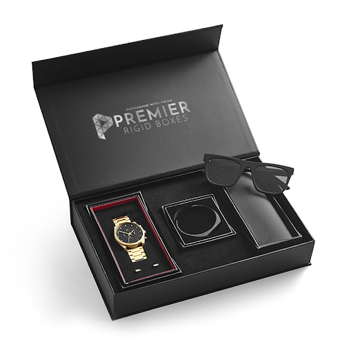
A founder I talked to last year had just dropped a small fortune on packaging for her skincare line foil accents, a magnetic lid, all of it. She was pretty proud, and honestly, it did look great in photos. Then real customers started opening the thing. The lid stopped catching after one use. The insert had already started sagging under the product’s weight. One review even called the box “heavier than it needed to be, in a bad way,” which is a strange thing to read about packaging you paid extra for. Turns out expensive-looking and actually well-made aren’t the same thing, and she’d only budgeted for the first one.
That gap catches more brands than people assume. Getting luxury packaging partway right isn’t the hard part. Getting all of it right, consistently, is and a handful of the same small mistakes keep showing up across brands that should know better.
Mistake One: Confusing More with Premium
Here’s the trap I see most often piling on every finishing technique available at once. Foil stamping, embossing, spot UV, a ribbon, a magnetic closure, all on one box, all at the same time. There’s a logic to it, sure: more effort should mean more luxury. Except it rarely plays out that way. A box trying to do everything ends up looking busy, and busy rarely feels expensive.
What actually reads as premium, more often than not, is a box that commits to one or two techniques and nails them, with enough restraint that each detail gets noticed instead of drowning out the others.
Mistake Two: Underestimating Structural Integrity
Foil and finish soak up most of the attention early in a design conversation. But structure is what determines whether the box holds up past that first use. A lid that won’t close with any real resistance. An insert that wasn’t built to carry the product’s actual weight over time. A tray that flexes when it really shouldn’t. None of these show up in a mockup photo customers feel them physically, even when they can’t quite explain what’s bothering them.
This is usually where budget gets misallocated. Money goes toward visual finish, and structural quality gets treated like a given, when it’s actually the part most likely to fail if corners get cut.
Mistake Three: Ignoring How the Box Performs After Multiple Uses
Custom luxury boxes usually get reused or repurposed, or at least handled more than once before anyone throws them out; honestly, that’s kind of the point of making it feel special to begin with. But a lot of premium packaging only gets designed and tested for that single first-open moment.
Magnetic closures that lose their grip after a handful of openings. Hinges that go loose. Fabric or paper linings that show wear almost immediately. If a box that’s supposed to feel like an investment starts falling apart within a week, it’s actively undoing the premium impression it was built to create in the first place.
Mistake Four: Inconsistent Branding Across the Line
Nothing kills a luxury feel faster than a product line where the packaging doesn’t quite match itself. A color tone that’s slightly off between products in the same collection. Fonts that shift from one SKU to the next for no obvious reason. A finish that’s glossy here and matte there.
Customers notice, even when they couldn’t tell you exactly what’s bugging them. It reads as sloppiness, which is basically the opposite of what luxury packaging is supposed to communicate.
Mistake Five: Sizing the Box Around the Product Instead of the Experience
A surprisingly common one: designing the box as tight and efficient as possible, the way you’d approach a budget SKU, then bolting premium finishes onto that shape afterward. It saves on material, sure, but it usually strips out the sense of occasion that comes from a little intentional space a lined interior, room for tissue, a reveal that takes longer than half a second.
Luxury packaging tends to benefit from feeling considered rather than just efficient. A box optimized purely to use the least material rarely delivers the moment customers actually paid for.
Mistake Six: Skipping Real-World Testing
Plenty of premium packaging looks flawless in a design mockup, then falls apart sometimes literally once it’s been through a warehouse, a delivery truck, and a customer’s hands. Corners crush. Magnets stop catching. Inserts shift out of place. None of this tends to show up in a polished sample; it shows up after the box has actually shipped a few hundred times.
Skipping that real-world testing step is one of the more common reasons a genuinely well-designed box fails in the field and by the time a brand notices, it’s usually already sitting in a review section.
Mistake Seven: Treating Packaging as a One-Time Decision
Packaging that felt premium two years ago can start looking dated fast, especially once competitors update their own design and customer expectations move on. Brands that set their box design once and forget about it often don’t notice how much it’s aged, right up until a competitor’s newer packaging makes theirs look tired by comparison.
Checking in on packaging periodically, even just to see if it still holds up against what’s currently out there, is usually worth a lot more than the small effort the review takes.
Final Though
Most of these mistakes trace back to treating packaging like a finishing touch instead of a real part of the product experience. Brands that avoid them tend to test structure just as carefully as they test visual finish, keep branding consistent across every SKU, and build in enough deliberate design not just efficiency to make the unboxing moment actually land. Getting that combination right, consistently, is what separates packaging that only looks premium in a photo from luxury boxes that hold up to real use.